
What Makes a Good Logo?
Everyone has an opinion about certain things in life like music, food, politics, and parenting. I think logo design is one of them. It doesn’t matter if you are a plumber or a lawyer, you would have opinions about logos. This is what makes logo design one of the biggest challenges in graphic design. The larger the business is, the more difficult it would be to settle on a logo that can reasonably satisfy all the decision makers. Ultimately a logo should not be about pleasing everyone who works for the company, because what they like personally is a separate issue from how well it works in the market. A logo that everyone absolutely loves may actually fail miserably in reality. As a matter of fact, if all you want is a logo that you personally like, you could get hundreds of designers (or non-designers) to compete for you at websites like 99designs.com. You can then choose whichever logo you like the best, and be done with it. So, what makes a good logo?
Much of the job of designing a logo is about educating the clients about what a logo is and how it works. This process is what often makes it expensive, and the most people are shocked and outraged to hear that some company paid millions of dollars for a logo that they themselves could draw in a matter of minutes, if not seconds. Suppose you work for Pepsi and you feel that the company needs a new logo. How would you go about achieving it? A logo is like a face of the company. Since the existing Pepsi logo has been in use for decades, it’s going to be very difficult to convince everyone that Pepsi needs a new logo. Because everyone has an opinion about logos, particularly about the logo of the company they work for, the toughest part of the job would not be designing a good looking logo, but convincing everyone to accept the new logo. A design firm would essentially be functioning like a political consultant or lawyer to win votes within Pepsi. That is what you would be paying for.
The Arnell Group who recently redesigned the Pepsi logo for real had to come up with an incredible array of arguments to win the internal support at Pepsi. Most of these arguments are probably nonsense and the people at The Arnell Group probably knew it too, but without someone willing to get up on stage to propose a solution, there would just be a bunch of critics in the audience arguing till the cows come home. If your company is new and doesn’t have a logo yet, this would certainly be a more pressing issue.
Equally important to managing the internal politics is market research. With a relatively simple shape, it needs to stand apart from the sea of logos in the same market. Even if the new design is beautiful and everyone loves it, if it looks just like the logo of a well-known competitor in your market, it would be useless, or even disastrous.
It also needs to be memorable. Even if the new logo is distinct, it may not be memorable. For something to be memorable, it needs to be relatively simple. Complex logos are hard to remember because we humans cannot retain too many visual details. We unconsciously reduce visual information to its essential elements. We take this ability for granted but it’s a skill that we acquire over many years in our childhood. This is why children gravitate toward cartoons. Cartoons tell them how to strip down visual information to its bare essentials, so that they can digest and remember only the relevant and useful information. When we see something, we don’t pay attention to all the visual details evenly; we extract and digest only the relevant information for any given context.

The logos you see above are of various universities around the world. Technically they are distinct but they all look the same to us because we don’t see the point of retaining all those visual details. Most of us couldn’t, even if we wanted to. So, in our minds, they are all a big blur like this:
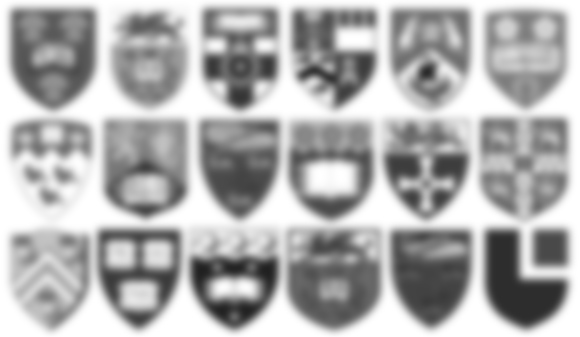
Pretty much the only thing we remember about them is that they are all shaped like a shield. It’s a good thing that logos aren’t that important for universities. Harvard University, for instance, is one of the most recognized brand names in the world, but most people probably couldn’t pick out their logo from above. The only one that is clearly identifiable and memorable is the last one for Loughborough University. Since all that we would take away from these logos is that they are in the shape of a shield, they might as well get rid of all the details like Loughborough did.
In comparison, the executives in the airline industry are much more educated about the value of branding, so they generally choose much simpler logos as you can see below.

Now, let’s blur them in the same way and see what they look like.
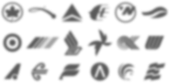
Even when the same amount of blur is applied to them, we can still recognize them, which is important because they might literally be blurry when we see them far away at the airport or on a fast moving airplane. Simple logos are also flexible. It can be used black and white, printed on a T-shirt, embroidered on a hat, etc.. Below you see the different applications of the Apple logo I found on the Internet. Imagine doing this with any of the university logos (except for Loughborough); it would simply be impossible.

Simple logos also inspire imagination. After Japan suffered the devastating Tsunami, graphic designers from around the world were inspired to create symbols and posters to help raise money for Japan. The Japanese flag is one of the simplest flags in the world (if not the simplest). If it weren’t for the simplicity, this would not have happened, and the amount of money raised to help them may have been quantifiably lower.
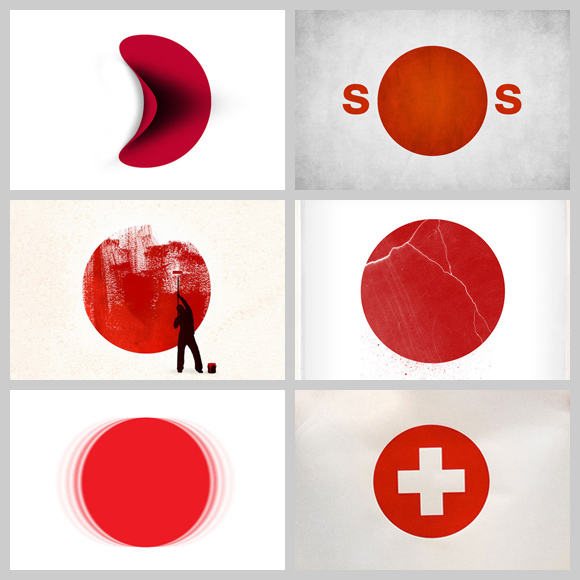
This, however, does not mean that simpler is always better. The idea is to make it as simple as possible while making sure that it’s still distinct and memorable. The reason why Japan’s flag works well is because no other country thought of using a red dot as a flag. If there were many other countries with a single dot on their flags, it wouldn’t have worked so well.
The people who do not understand how logos work are often looking to be wowed by the logo when they hire a designer. They are looking for something that they could not draw themselves. It would require a supremely confident designer to propose something like the Japanese flag. In their minds, they are paying the designer a lot of money for their logo, so they want to feel that they got their money’s worth. What would satisfy them would be something like these:

These are the sort of logos where the client goes, “Yeah! That’s what I’m talking ’bout!” and I quietly say, “Yes, I know.” As you would have to agree, a lot of work went into creating these logos. In terms of the amount of labor and skills involved, you would feel like you got your money’s worth, but great logos are not about how hard it is to draw them. You are not paying the designers for their craftsmanship. You want to be clearly distinguished from the others in your market, be easily recognized, and be more memorable than your competitors. You want your logo to help you do that. The logos with wow-factors like the ones above are only going to help promote the designers, not your business. They are in fact generic and unmemorable in their complexity and use of cliché.
Lastly, what is a fair price for designing a logo? This is a popular question for obvious reasons. If I sufficiently explained how logos work in this newsletter, you would probably understand that there wouldn’t be any set price for developing a logo because you are not paying for the product but for the process to arrive at the final product. The final product may only take a minute to draw. You are paying for the process you and your designer go through to arrive at that conclusion. Depending on the designer or design firm, it could be $100 or $1,000,000. I would suggest that you figure out how much you are willing to spend for a logo, which would be a reflection on how much value you see in it. With the given budget, the design firm would figure out how deeply they could explore various options and conduct research. To be realistic, a logo isn’t important for every business. It wouldn’t matter much, for instance, for universities or corporate law firms, but it does matter a lot for most retail businesses.